
ISO Film Sensitivity and Grain
When you pick a roll, ISO tells you how sensitive the film is to light. A low ISO like 100 needs more light and gives you smooth, fine grain. A high ISO like 800 or 1600 needs less light but shows more grain and stronger contrast. Think of ISO as the film’s reading glasses: the higher the number, the more it sees in dim places, but the more texture it adds to the picture.
You’ll notice grain like tiny dots when you enlarge a shot, and that texture becomes part of your image’s personality. Some photographers love grain for its raw, filmic feel; others want clean detail. Use grain as a tool: add mood with higher ISO, or avoid it by choosing lower ISO and slower shutter speeds.
If you’re building your knowledge, start simple and test. Load different film types, shoot the same scene, and compare prints or scans. This is the practical side of Film Types Explained: ISO, Color vs Black & White, and How to Choose the Right Film for Your Photography Style — you’ll see how ISO, color, and grain work together to shape your photos.
How ISO affects exposure and sharpness
Higher ISO film needs less light, so you can use faster shutter speeds. Faster shutters freeze motion and can make your shots look sharper in practice, which helps avoid blur from camera shake or moving subjects.
There’s a trade-off: higher ISO usually brings more grain, which can soften fine detail up close. Balance motion control versus fine-detail clarity by choosing the ISO that fits the scene and your desired look.
High ISO film for low light and noise control
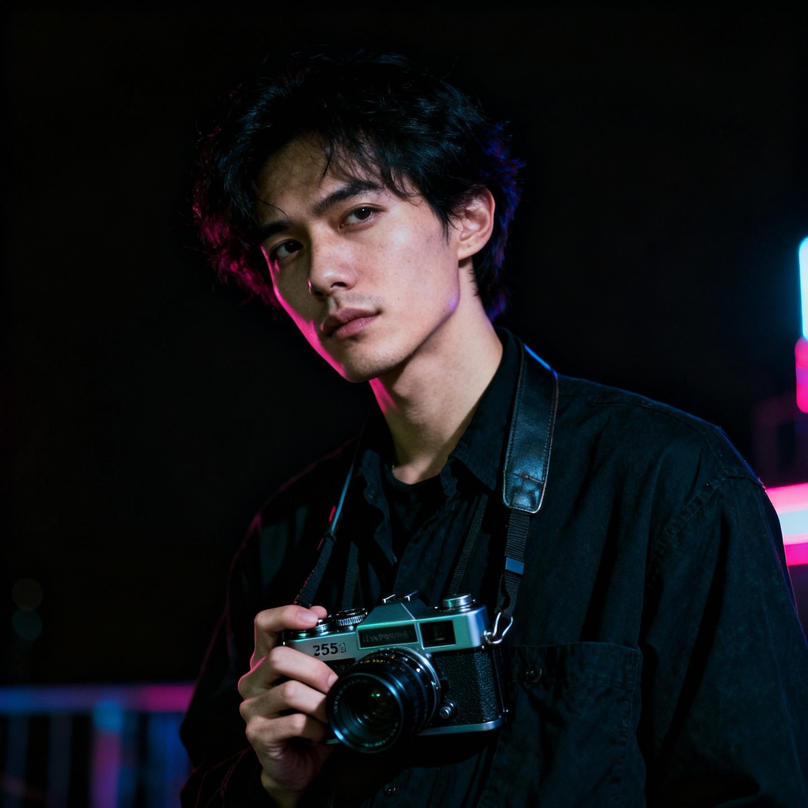
When you shoot at night or inside dim rooms, high ISO film is your friend. It lets you capture scenes without flash and keeps ambient mood — street shooters often reach for 800 or 1600 to keep life moving and light natural.
To control the resulting noise (grain), try stronger light on the subject, use a steady support, or carefully push/pull development. You can also pick films known for finer grain at high ISO if you want cleaner images. In short: use high ISO when you need speed, and tweak technique to manage the texture it brings.
Read film grain texture
Study grain like handwriting: step back to get the whole picture, then zoom in to see patterns. Compare how your chosen film renders skin, skies, and fabrics. Make test shots and scans to learn which grain you love and which you want to avoid.
Color vs Black and White Film Traits
Color film gives you vivid palettes and mood in a single frame. When you pick a color stock you’re choosing how saturation, hue, and contrast will sing together. Some films push reds and greens; others favor skin tones. That choice shapes your story before you press the shutter.
Black and white film strips the world to tone, texture, and contrast, so your eye reads light and shadow differently. You’ll notice grain, edge definition, and how midtones fall into place. This makes portraits feel intimate and streetscapes dramatic—the lack of color forces you to think about shape and emotion.
Think of film choice like picking shoes for a trip: color stocks are bright sneakers for the festival; black and white are well-worn boots for a moody hike. The guide Film Types Explained: ISO, Color vs Black & White, and How to Choose the Right Film for Your Photography Style points you to specific stocks and ISO choices that match the mood you want.
Color film saturation, contrast, and color shifts
Color stocks differ wildly. Some are low-saturation and soft, perfect for natural-looking portraits. Others crank up saturation and contrast for landscapes that pop. Processing and shooting choices change those traits: push processing raises contrast and grain; cross-processing can create wild color shifts—use these tools like spices.
Black and white film processing and tonality
B&W film responds strongly to developer choice and time. Shorter or weaker development yields soft midtones; longer or stronger brings high contrast and deep blacks. Filters, paper, and enlarger settings tune the picture further: a red filter deepens skies; fine-grain developers keep detail for large prints. For gritty street photos, push a fast film; for smooth portraits, shoot a slower film and develop gently.
Vintage film aesthetics
Expired or older stocks give muted colors, unpredictable shifts, and extra grain that feel warm and lived-in, like an old song on vinyl. Use expired film when you want nostalgia: it won’t be perfect, but it will be honest and full of character.
Choosing Film Stock for Your Style
Pick film like you pick a voice — it should speak for your images. If you love warm, natural skin and soft highlights, reach for Kodak Portra in 160 or 400. If you want punchy, saturated colors for fashion or editorial work, consider Kodak Ektar or Fuji Velvia. Match ISO to light: low ISO (50–100) for sharp, fine-grain detail; medium ISO (200–400) for everyday shooting with forgiving latitude; high ISO for mood and grain.
Think of film as a set of tools in your kit. For portraits you want smooth skin tones and gentle contrast; for landscapes you want high color fidelity and wide dynamic range. Your choice affects grain, latitude, and color bias — those are the levers you pull to get mood. Try a roll with one camera and one lens, and you’ll see how film personality blends with your style.
You don’t have to memorize specs to start. Shoot a few rolls of different stocks, compare scans, and keep notes on light, lens, and exposure. Over time you’ll build a short list of favorite go-to films that save time and sharpen your signature.
Portrait film recommendations for skin tones
For soft, flattering skin tones, Kodak Portra 160/400 is a go-to. It tames highlights, preserves subtle color shifts, and gives a warm, natural look. For richer color and a slightly punchier look, try Fuji Pro 400H (if available) or Ektar at lower ISOs for strong color with fine grain. For classic B&W portraits, Ilford HP5 or Ilford Delta 400 give expressive grain and great contrast control.
Landscape film choices for color and detail
For bold landscapes with vivid skies and punchy foliage, Fuji Velvia 50 is a favorite—saturated colors and crisp detail when well exposed. If you want rich color with more latitude, Kodak Ektar 100 offers strong saturation and fine grain. For neutral tones and wide dynamic range—moody coastlines or soft dawn light—choose Portra 160 or color negatives in 100–200 ISO. Slide film (like Provia) yields clarity for well-exposed scenes but is less forgiving. For dramatic B&W landscapes, try Ilford FP4 for clean tonality and fine grain.
Practical tips for choosing film
Match film to light and mood: use low ISO for bright, detailed shots and higher ISO for grainy, atmospheric images; pick color negative for forgiving exposure and rich skin tones, slide film for vivid color when you can nail exposure, and black-and-white for timeless texture. Always shoot test rolls, bracket exposures, and keep a log of which film delivered the look you wanted.
Conclusion: Film Types Explained: ISO, Color vs Black & White, and How to Choose the Right Film for Your Photography Style is a practical framework — experiment, take notes, and let your chosen films become part of your photographic voice.
Matheus is a passionate analog photographer and content educator dedicated to preserving the art of film photography. With over 12 years of experience capturing moments through 35mm cameras, he has transformed his obsession into a mission: sharing deep knowledge with a global community of enthusiasts.
He began his journey at 16 with a Pentax K1000 inherited from his grandfather, a photojournalist who documented historic events in the 1970s. That simple yet powerful camera sparked an insatiable curiosity about how light, chemistry, and intention combine to create unforgettable images.
Matheus has developed expertise across multiple disciplines: film selection and storage, advanced development techniques, composition, and creative post-processing. He is a passionate advocate for the analog philosophy — the belief that shooting film is not just a technical choice, but a way of being present in the world and thinking deeply about every frame.
His educational approach is unique: combining technical rigor with creative inspiration. Matheus believes that understanding the science behind analog photography liberates photographers to explore their artistic vision without limits.
When not writing or shooting, Matheus explores cities with his Leica M3, mentors emerging photographers, and conducts workshops on analog photography in local communities.
His mission with RIVERZOG: To prove that analog photography is not nostalgia — it’s a conscious choice for quality, intention, and depth in an increasingly digital world.